Unbounce is a widely used popular landing page builder and platform. Some of the landing pages require to add a menu. For a better user experience in the mobile view, the landing pages menu must need to convert into a collapsible mobile menu. But, on Unbounce no default option for creating a collapsible mobile menu. In this article, we are going to show the easiest way to create a collapsible mobile menu on Unbounce. Let get started…
3 Steps to get desired Unbounce collapsible mobile menu:
- Setup Menu bar for desktop on Unbounce
- Setup Menu bar for Mobile on Unbounce
- Adding custom CSS and Javascript
Step 1: Setup Menu bar for desktop on Unbounce
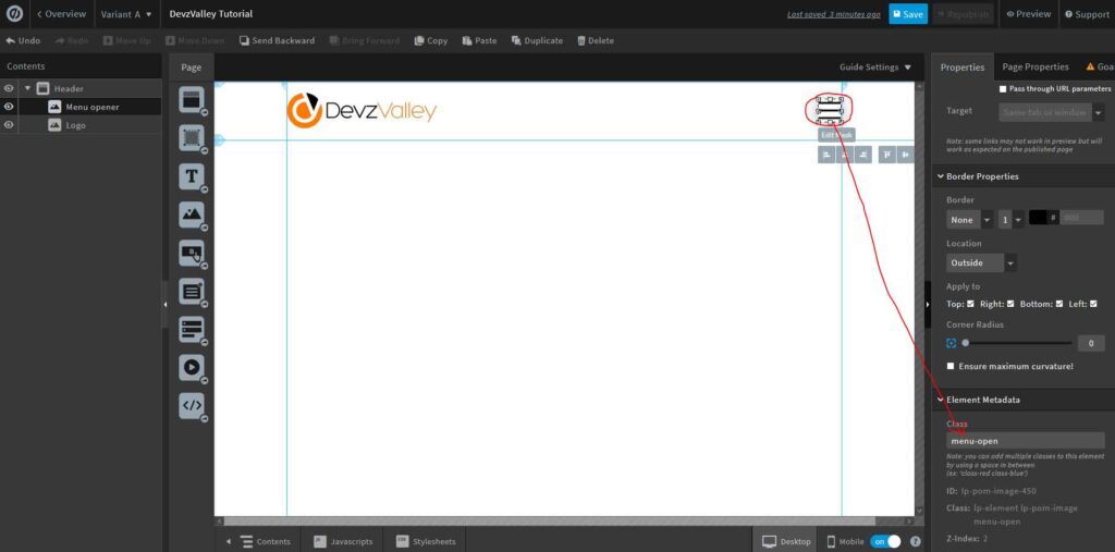
Let’s add a section for the header on your Unbounce page. On the left side add your logo and on the right side add a hamburger menu icon. Add class menu-open to the hamburger menu icon. The header section will look like the screenshot below.
Let’s hide the hamburger menu icon for desktop from the Unbounce components bar. After this add a new box element on the header section and add a class navbar to the box. Now add some buttons as menu items and a navbar close icon into to box element, same as the screenshot below. Add class close-nav to navbar close icon. Hide the navbar close icon for desktop from the Unbounce components bar.
Step 2: Setup Menu bar for Mobile on Unbounce
Let’s switch to the mobile view from the Unbounce editor. Do the box containing the menu item 320px width and rearrange the menu buttons and close icon as the screenshot below. Set the navbar box position Left: -460px and top: 0px. Make the hamburger menu icon and navbar close icon visible in the mobile view. Also, place the hamburger menu icon in the right position.
Step 3 (Final Step): Adding custom CSS and Javascript
We are at the final step. In this step, you required to add some custom CSS and Javascript code to work collapsible menu on your Unbounce page. From the stylesheets option on Unbounce editor add the code below:
  @media only screen and (max-width: 600px) {
    .navbar{
      position: fixed !important;
      left:-500px !important;
      height:100% !important;
      transition: all 0.4s ease;
    }
    .navbar.activeNav{
      left:0px !important;
    }
  }
After adding the CSS code let’s open the Javascript option on Unbounce Editor. At first, add the Latest Stable Versions of jQuery in the head. Finally, add the javascript code below before the body end tag:
  $(document).ready(function(){
    $(".menu-open").click(function(){
      $(".navbar").toggleClass("activeNav");
    });
    $(".navbar").click(function(){
      $(this).removeClass("activeNav");
    });
  });
You are all set… Check the final output here.


